Devpost
Participate in our public hackathons
Devpost for Teams
Access your company's private hackathons
Grow your developer ecosystem and promote your platform
Drive innovation, collaboration, and retention within your organization
By use case
Blog
Insights into hackathon planning and participation
Customer stories
Inspiration from peers and other industry leaders
Planning guides
Best practices for planning online and in-person hackathons
Webinars & events
Upcoming events and on-demand recordings
Help desk
Common questions and support documentation
This project aims to paint a picture that demonstrates just how long the struggle for civil rights has been. The patient resistance on unjust systems across generations.
Visualizing the rape cases in India.
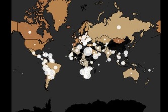
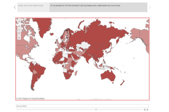
A webpage with an interactive global covid data visualization map
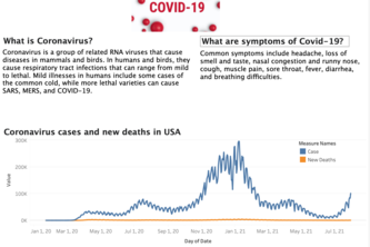
We demonstrate covid new deaths and cases in USA
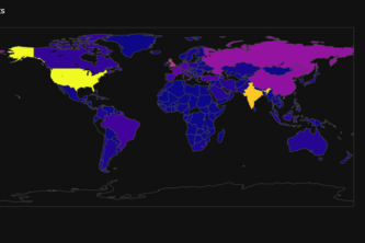
Initially, we just wanted to know how bad the situation is in our country India, as compared to other countries as we had high numbers of confirmed cases.
Visualization of COVID related data of India
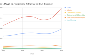
Our project is centered over the importance of the COVID-19 pandemic and its influence on society, more specifically, how it has been a major contributor to gun violence across the United States!
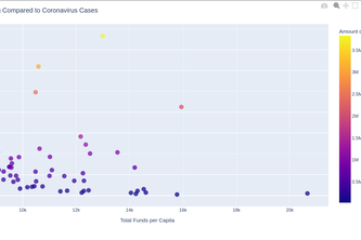
How much does each country's economic development depend on int'l loans/aid? I attempted to visualize this through data on the amount (in USD) of IBRD loans and IDA credits each countries received
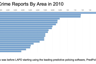
In our project, we looked at a crime dataset from LAPD and considered the effect PredPol, a predictive policing software, may have had on crime rates following its introduction.
Let the dataset change your mindset - Hans Rosling
These sets of graphs show patterns in the frequency in COVID cases and the nuances in the types of cases as well. It is important to see there is a correlation between all the graphs.
An Analysis of Union Density and their correlation to economic factors to examine their benifits.
Concluding that vaccination in India has improved its economic/GDP growth
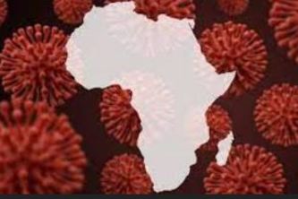
An interactive dashboard that visualizes economic aspects of the Subsaharan region
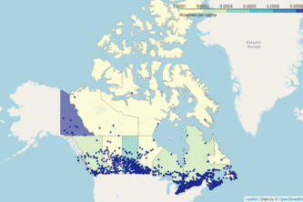
We analyzed public health data and made some visuals to help show our findings about Canadian Health Facilities and COVID Analysis. For this, we used visuals like interactive maps, charts, and graphs.
Lighting up the dark
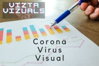
⭐⭐Corona Virus Dataset Visualisation⭐⭐
This project is a ML app which predicts the kidney disease & stones formed along with all the logs and visualizations concerned with kidney related problems.
We worked on collecting and analyzing data about Asian Hate Crimes and hate crimes in general of cities across the country.
Analysis of the federal debt and funding utilizing python and plotly.
Provides full insight into the spread of the pandemic.
COVID-19 has disrupted our daily lives from academia to the workplace. Here we took the challenge of telling the story of unemployment in 3 data visualizations!
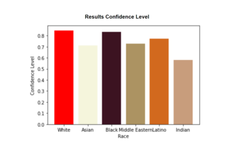
Visualizes Bias in Facial Recognition Software.
25 – 48 of 59